2025
Procore Product Updates Newsletter
Procore Product Updates Newsletter
Procore Product Updates Newsletter
I reviewed Procore’s existing product-update communications and found the same structures recurring across launches, feature releases, coming-soon announcements, and betas. I turned those structures into a responsive newsletter template with four release modules and 16 monthly headers.
I reviewed Procore’s existing product-update communications and found the same structures recurring across launches, feature releases, coming-soon announcements, and betas. I turned those structures into a responsive newsletter template with four release modules and 16 monthly headers.
I reviewed Procore’s existing product-update communications and found the same structures recurring across launches, feature releases, coming-soon announcements, and betas. I turned those structures into a responsive newsletter template with four release modules and 16 monthly headers.
Email Design
Responsive Layouts
Figma Components

Role
Led the visual design of the responsive newsletter, reusable modules, and header library.
Timeline
August 2025
Audience
Procore marketing and product-communications teams.
Deliverables
Responsive newsletter templates, four release modules, 16 monthly headers, and rules for content length and missing fields.
What changed
What changed
The team had 20 prebuilt parts—16 headers and four release modules—for assembling recurring product updates without redesigning the newsletter each month. This made issues faster to assemble and easier to keep consistent.
The team had 20 prebuilt parts—16 headers and four release modules—for assembling recurring product updates without redesigning the newsletter each month. This made issues faster to assemble and easier to keep consistent.
16
Monthly header covers
4
Standard release modules
00 / What existed
I started with the emails already in use
Repeated content needs were hiding inside one-off layouts
Repeated content needs were hiding inside one-off layouts
Repeated content needs were hiding inside one-off layouts
I reviewed the existing newsletter and related product-update communications. Launches, feature releases, coming-soon items, and betas varied in detail, but they repeated the same basic content needs. That review defined which parts could become modules and which needed room to change.
I reviewed the existing newsletter and related product-update communications. Launches, feature releases, coming-soon items, and betas varied in detail, but they repeated the same basic content needs. That review defined which parts could become modules and which needed room to change.
I reviewed the existing newsletter and related product-update communications. Launches, feature releases, coming-soon items, and betas varied in detail, but they repeated the same basic content needs. That review defined which parts could become modules and which needed room to change.


Using Procore’s existing visual language
I used Procore’s typography, color, CTA, and icon styles to create a clear reading order. Content and header artwork could change from issue to issue while the release information followed the same structure.

Using Procore’s existing visual language
I used Procore’s typography, color, CTA, and icon styles to create a clear reading order. Content and header artwork could change from issue to issue while the release information followed the same structure.
Using Procore’s existing visual language
I used Procore’s typography, color, CTA, and icon styles to create a clear reading order. Content and header artwork could change from issue to issue while the release information followed the same structure.
01 / What I changed
I broke one newsletter into parts the team could reuse
I broke one newsletter into parts the team could reuse
I broke one newsletter into parts the team could reuse
One shared Figma toolkit
The toolkit included a header, four release modules, solution blocks, a prefooter, footer, and shared icons. Each issue could be assembled from those parts instead of starting with a blank file.

One shared Figma toolkit
The toolkit included a header, four release modules, solution blocks, a prefooter, footer, and shared icons. Each issue could be assembled from those parts instead of starting with a blank file.
One shared Figma toolkit
The toolkit included a header, four release modules, solution blocks, a prefooter, footer, and shared icons. Each issue could be assembled from those parts instead of starting with a blank file.
WHAT TO NOTICE
The parts came from work the team was already repeating.
The parts came from work the team was already repeating.
The parts came from work the team was already repeating.
One monthly email was separated into the pieces that recurred: headers, release sections, solution blocks, footer patterns, and icons.
One monthly email was separated into the pieces that recurred: headers, release sections, solution blocks, footer patterns, and icons.
That gave the team a shared starting point for the next issue.
That gave the team a shared starting point for the next issue.
02 / How the modules behaved
The modules had rules for incomplete and over-length content
The modules had rules for incomplete and over-length content
The modules had rules for incomplete and over-length content
Missing fields, overflow, and truncation
I specified what should happen when content was missing, too long, or did not fit the ideal example. Collapse, truncation, and fallback rules kept those cases from breaking the layout.

Missing fields, overflow, and truncation
I specified what should happen when content was missing, too long, or did not fit the ideal example. Collapse, truncation, and fallback rules kept those cases from breaking the layout.
Missing fields, overflow, and truncation
I specified what should happen when content was missing, too long, or did not fit the ideal example. Collapse, truncation, and fallback rules kept those cases from breaking the layout.
WHY IT MATTERS
Edge cases were part of the template.
Edge cases were part of the template.
Edge cases were part of the template.
I specified what should happen when content was missing, too long, or did not fit the ideal example. Collapse, truncation, and fallback rules kept those cases from breaking the layout.
I specified what should happen when content was missing, too long, or did not fit the ideal example. Collapse, truncation, and fallback rules kept those cases from breaking the layout.
Without those rules, the team would still need one-off fixes every month. Documenting the exceptions made the components useful with the content people actually had.
Without those rules, the team would still need one-off fixes every month. Documenting the exceptions made the components useful with the content people actually had.
03 / What the team could reuse
Monthly issues could start from a shared kit
Monthly issues could start from a shared kit
Monthly issues could start from a shared kit
Sixteen headers and four release modules
Sixteen prebuilt headers gave each month a different opening while keeping the newsletter familiar. Four standard release modules covered the recurring product-update types.

Sixteen headers and four release modules
Sixteen prebuilt headers gave each month a different opening while keeping the newsletter familiar. Four standard release modules covered the recurring product-update types.
Sixteen headers and four release modules
Sixteen prebuilt headers gave each month a different opening while keeping the newsletter familiar. Four standard release modules covered the recurring product-update types.
Original email → redesigned template
Original email → redesigned template
Original email → redesigned template
The original one-off email is shown beside the redesigned issue. The comparison shows the clearer type hierarchy, repeated module structure, and the production rules added for future issues.
The original one-off email is shown beside the redesigned issue. The comparison shows the clearer type hierarchy, repeated module structure, and the production rules added for future issues.
The original one-off email is shown beside the redesigned issue. The comparison shows the clearer type hierarchy, repeated module structure, and the production rules added for future issues.
BEFORE — ORIGINAL EMAIL
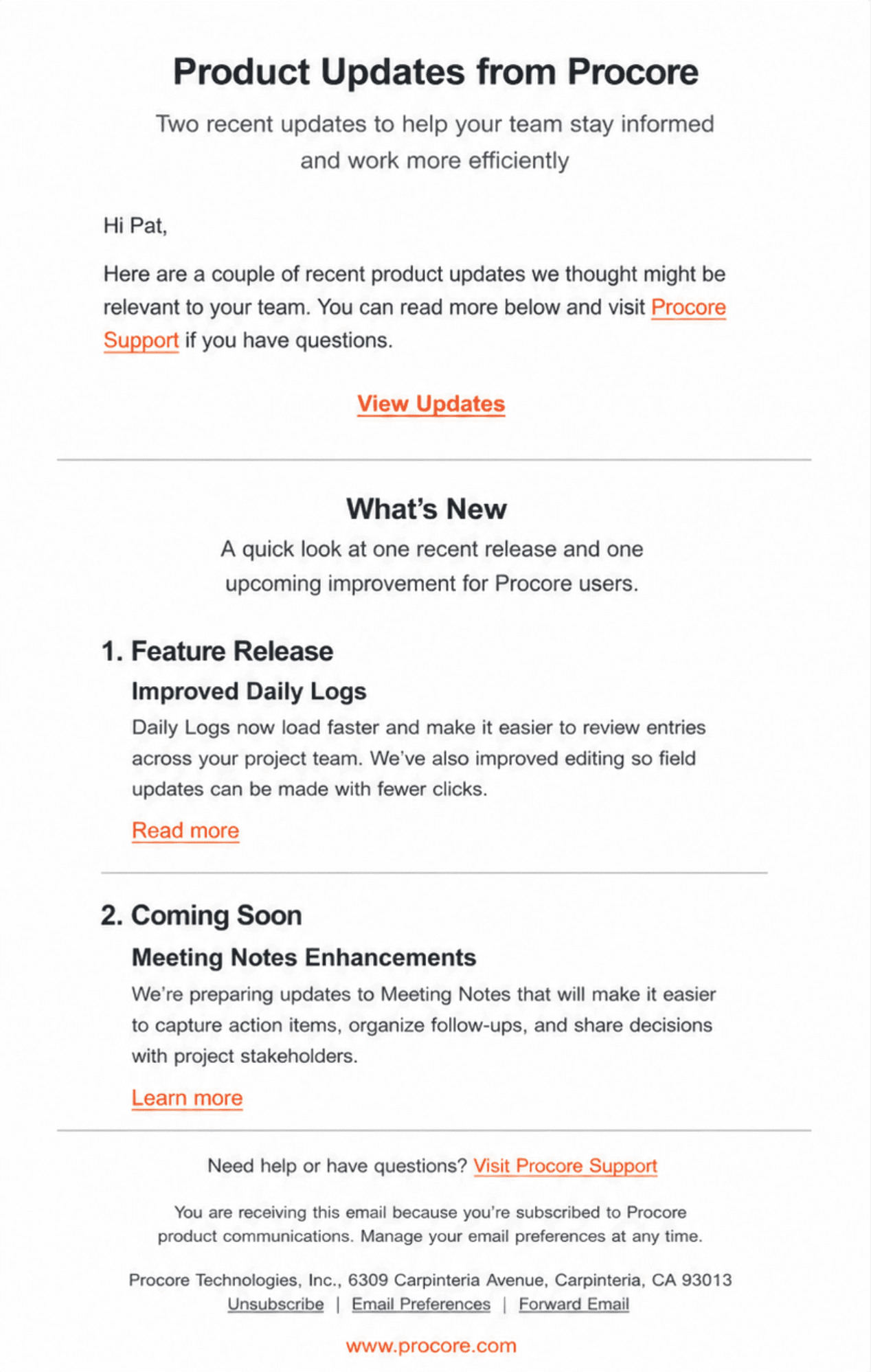
AFTER — REDESIGNED TEMPLATE

© 2026 Gilad Shahar