2023
Inside Salesforce
Inside Salesforce
Inside Salesforce
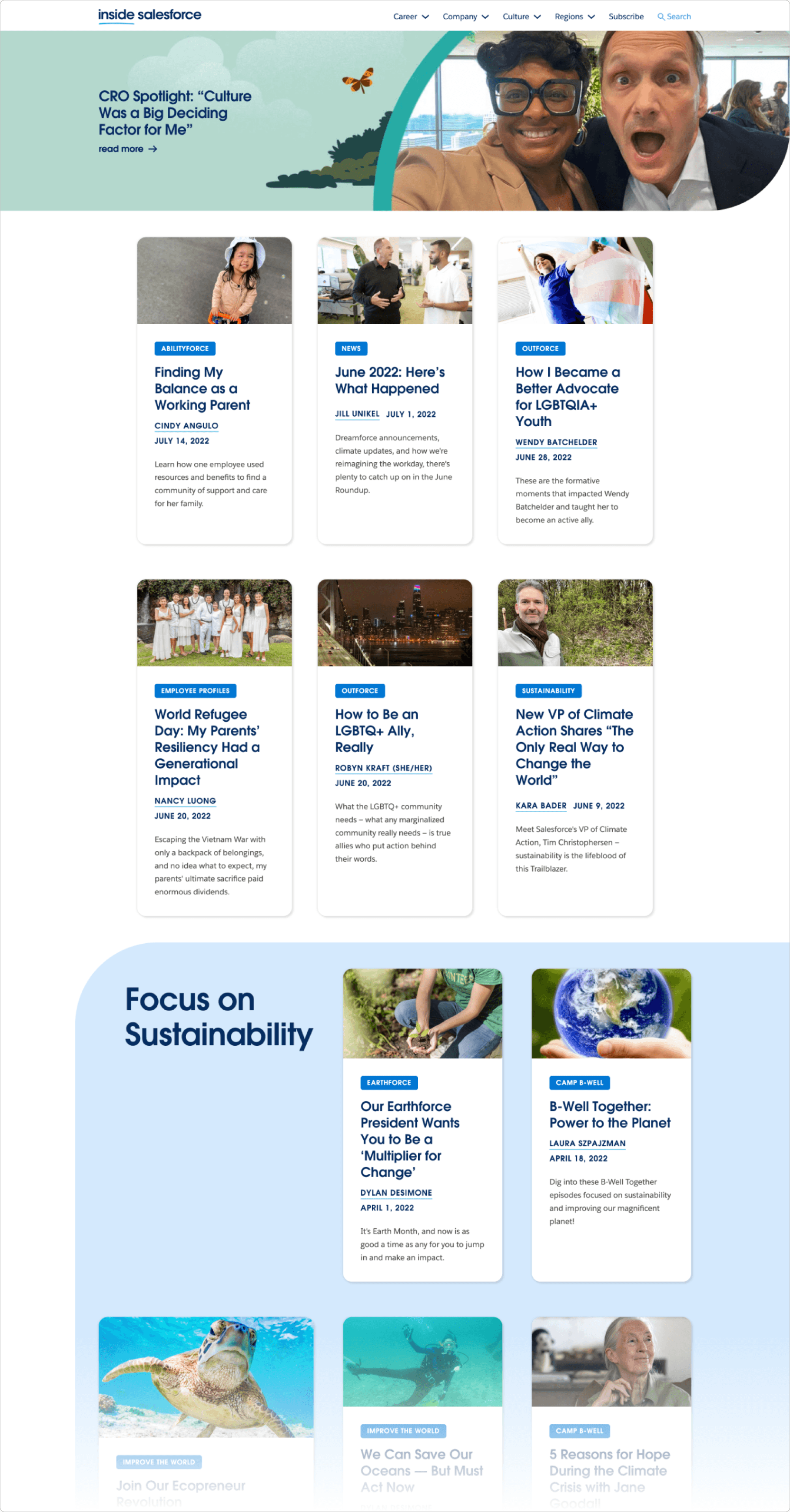
A reusable publishing system for Salesforce’s internal content hub — designed to clarify navigation, standardize WordPress templates, and support stronger microsite governance.
UX/UI
Information Architecture
Design Systems

Role
UX/UI design lead for IA, navigation, templates, and usability validation.
Timeline
Feb – Jun 2023
Audience
Internal Salesforce teams and employees.
Deliverables
IA model, WordPress templates, reusable blocks, style guide, and handoff specs.
What changed
What changed
A fragmented publishing experience became a reusable system that content teams could understand, maintain, and extend without introducing design drift.
+30%
Average time on landing page
4
Microsites launched with the new model
01 / Outcome
A cleaner publishing system, not just a redesign
The work moved Inside Salesforce from one-off page patterns to reusable templates, clearer navigation, and a maintainable editorial system.

Before
Before

After
After
02 / Problem
The publishing model could not scale without clearer structure
Why the system needed to change
Inside Salesforce had to support evergreen resources, timely updates, and microsite-like areas — all while remaining easy for non-designers to publish and maintain.

Why the system needed to change
Inside Salesforce had to support evergreen resources, timely updates, and microsite-like areas — all while remaining easy for non-designers to publish and maintain.

Why the system needed to change
Inside Salesforce had to support evergreen resources, timely updates, and microsite-like areas — all while remaining easy for non-designers to publish and maintain.

03 / research
Research became a reusable publishing model
Research insights
I combined stakeholder sessions, a current-state audit, and competitive analysis to identify where employees were losing context — navigation, category structure, layout consistency, and content governance.

Research insights
I combined stakeholder sessions, a current-state audit, and competitive analysis to identify where employees were losing context — navigation, category structure, layout consistency, and content governance.

Research insights
I combined stakeholder sessions, a current-state audit, and competitive analysis to identify where employees were losing context — navigation, category structure, layout consistency, and content governance.

WHAT TO NOTICE
The audit turned scattered evidence into a system brief.
Navigation pain points, repeated layout decisions, unclear ownership, and governance gaps were grouped into patterns the design system could address.
This is where the work shifted from a visual redesign to operational clarity.
03 / System Design
Building blocks for page layouts
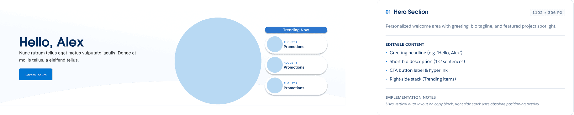
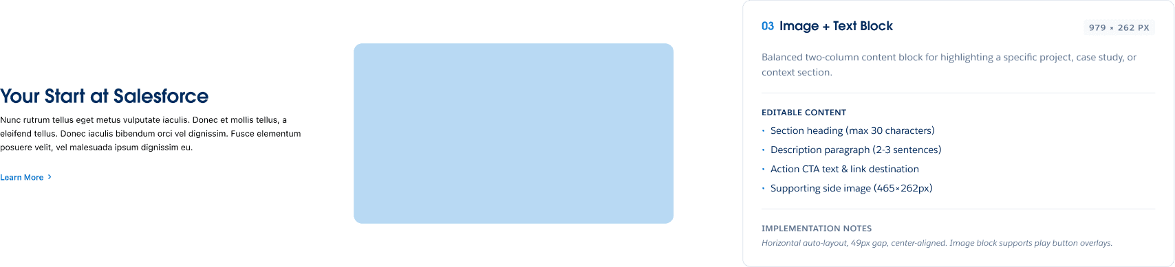
Reusable components in Figma
I translated the audit into low-fidelity structures, reusable page templates, and component rules that could flex across landing pages, resource hubs, topic pages, and microsite sections.


Secondary navigation
Added an animated nav bar for migrating microsites

04 / Validation
Usability testing challenged the navigation model
Testing the navigation model
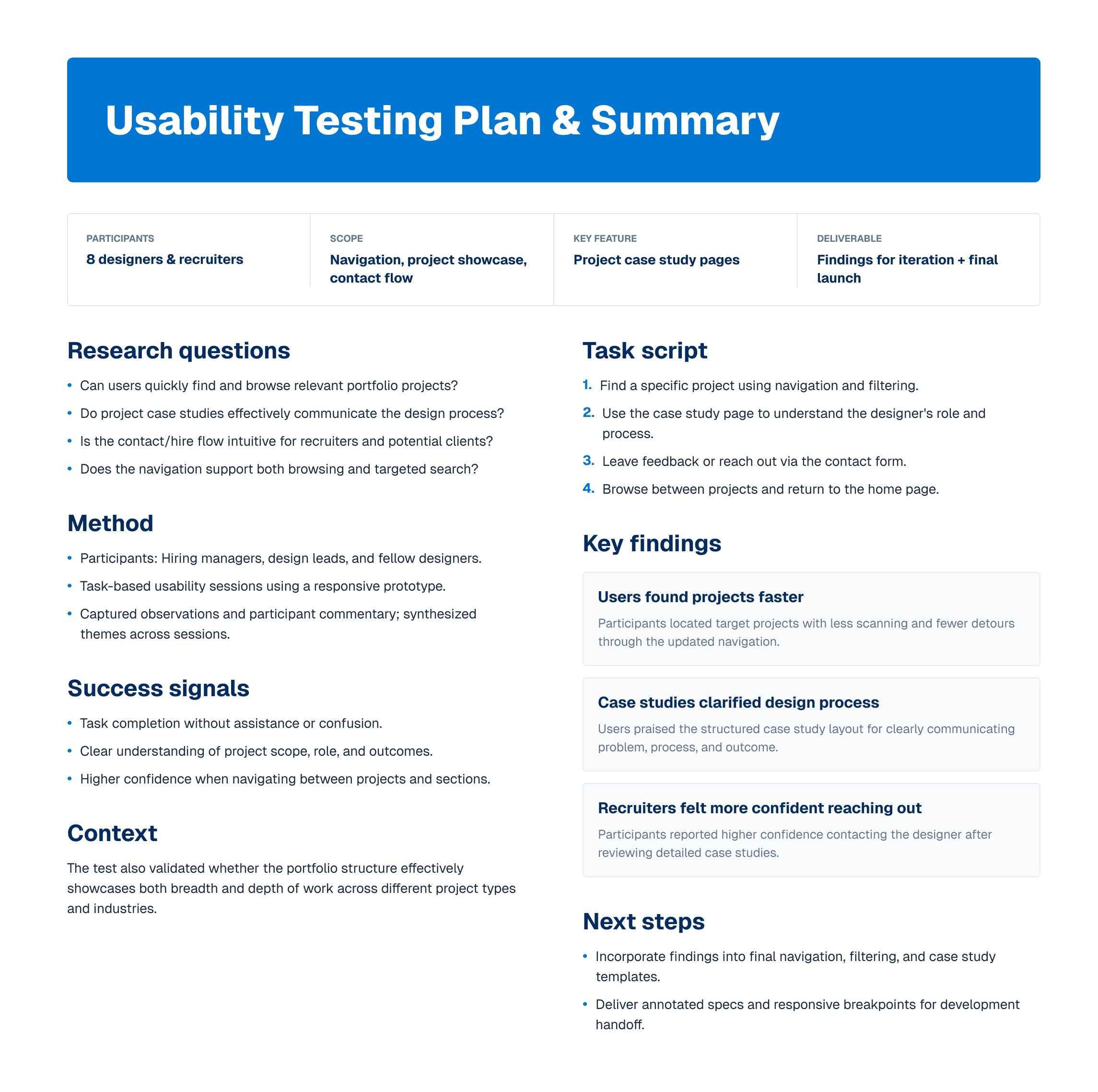
A lightweight usability plan kept sessions comparable across participants and focused the evaluation on content discovery, microsite orientation, and confidence moving between categories.

Testing the navigation model
A lightweight usability plan kept sessions comparable across participants and focused the evaluation on content discovery, microsite orientation, and confidence moving between categories.

Testing the navigation model
A lightweight usability plan kept sessions comparable across participants and focused the evaluation on content discovery, microsite orientation, and confidence moving between categories.

05 / Handoff
Documentation made the system usable after launch
Documenting the system
The final documentation connected Figma specs, WordPress-ready components, style guidance, and editorial rules so developers and content owners could continue extending the system consistently.

Documenting the system
The final documentation connected Figma specs, WordPress-ready components, style guidance, and editorial rules so developers and content owners could continue extending the system consistently.

Documenting the system
The final documentation connected Figma specs, WordPress-ready components, style guidance, and editorial rules so developers and content owners could continue extending the system consistently.

WHY IT MATTERS
The documentation made the system maintainable.
The handoff translated the system for the people who would keep using it: developers needed specifications, editors needed publishing rules, and stakeholders needed a shared source of truth.
The goal was continuity after launch — not dependency on one designer.
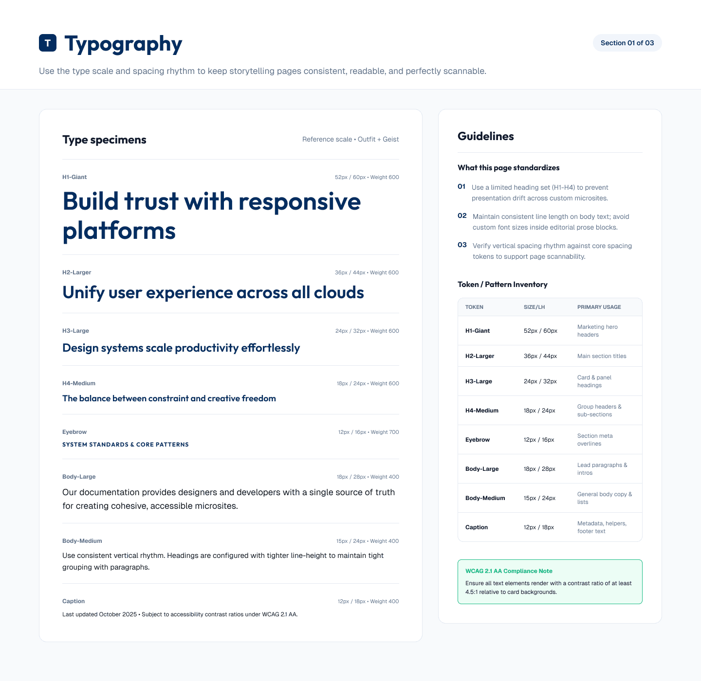
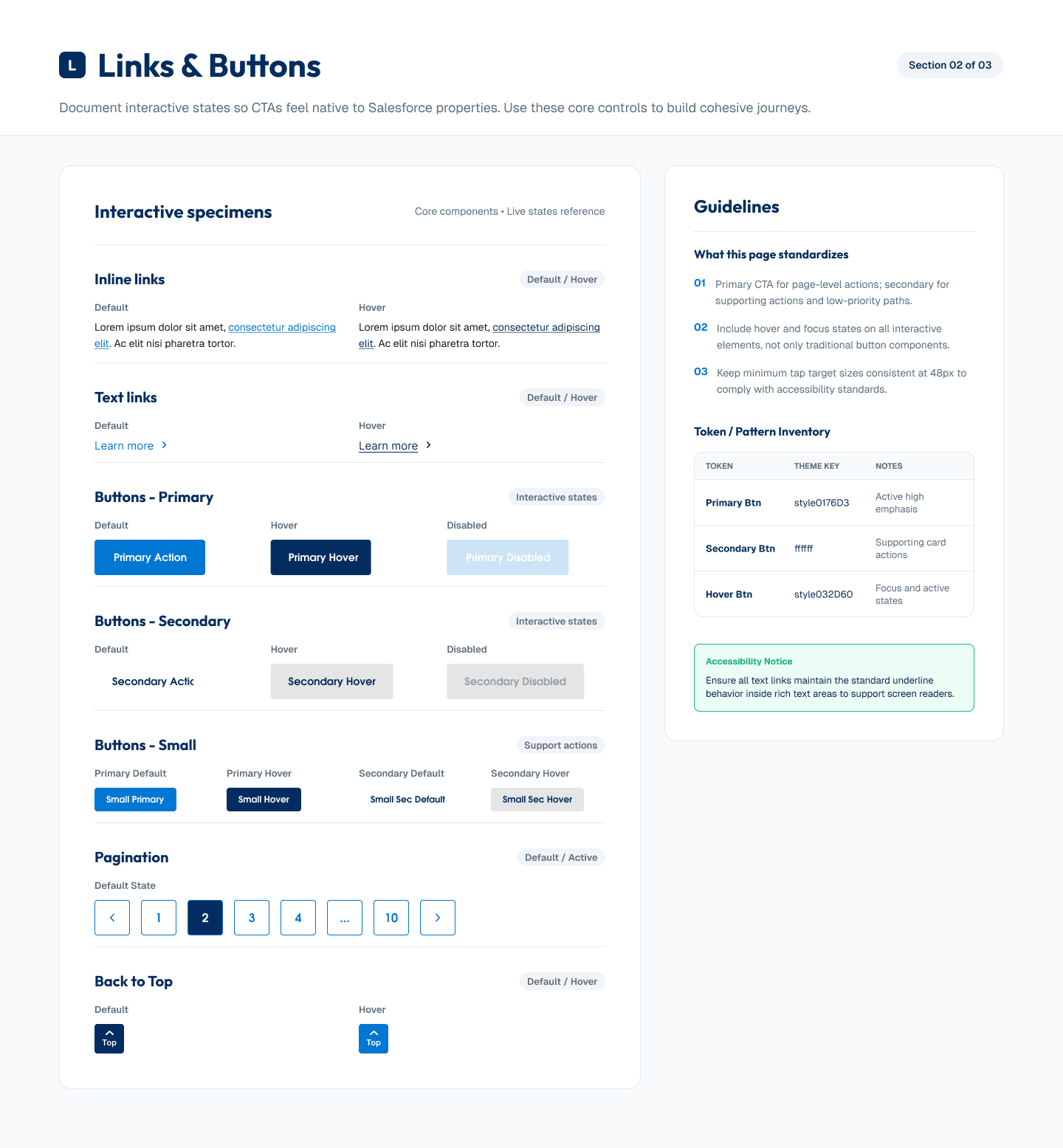
Style guidance for repeatable publishing
The style guide documented typography, CTA states, filters, and lightweight UI patterns so future pages could stay consistent without starting from scratch.


Editor-ready implementation notes
A shared content-block spreadsheet turned the design system into practical guidance for WordPress editors and implementation partners.

© 2025 Gilad Shahar